Delivery Pal Restaurant Gateway
UI, UX & Research
Overview
Food & beverage franchise soared in China in recent years, and with Corona's hit on the economy, a lot of independent workers choose to open a virtual restaurant, or to join a franchise with low entry fee starting around $8000. On the other hand, runner-ups want to grow and become thousand-store franchise. As a result, Delivery Pal is born as a mobile gateway on Wechat, for franchise, restaurant owners, and marketing and design freelancers.
My Role
I collaborated with boss on redesigning the UI, UX & Research.
My Process
- Understand product logic and dissect user needs by talking to boss and marketing colleague and looking through prototypes
- Experience existing virtual restaurant business platforms
- Watch how marketing colleague help clients grow business
- Synthesize findings into the redesign
User
- Virtual restaurants, although cheap to start, usually fail within two weeks due to their reliance on online traffic and a lack of dine-in option.
- When it comes to hiring marketing freelancers, restaurant owners usually lack understanding of how marketing work and cannot build long-term collaboration with freelancers.
- On the other hand, freelancer's work ethic becomes hindered, and the market goes worse.
- Some choose to join a franchise or to restart at a new location.
- Only those who are more attuned to marketing and cooking perform well.
Goal
- Showcase franchise
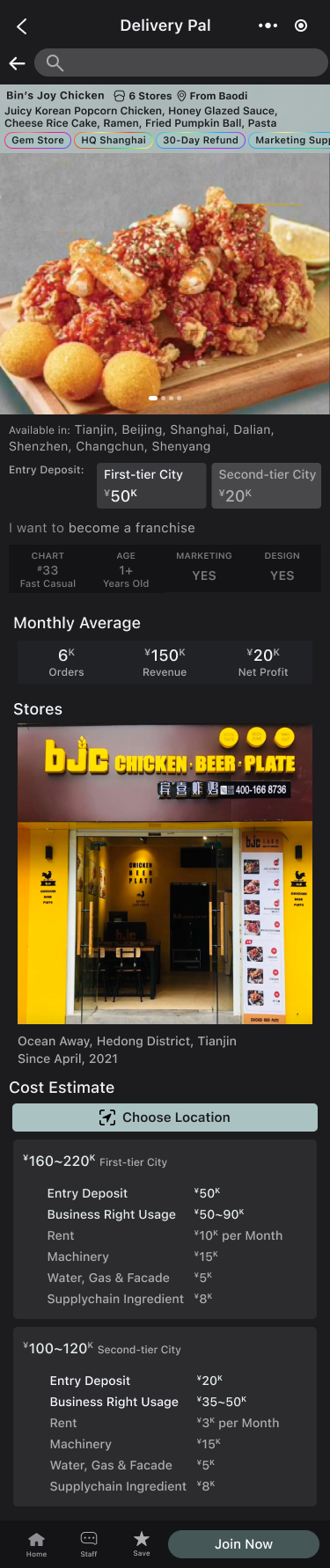
- Collect restaurant's information when user use revenue calculator, such as location and sales, and sell to franchise
- Collect franchise joining fee and provide 30-day refund warranty
- Offer marketing & design service marketplace
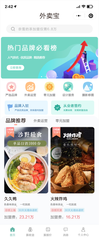
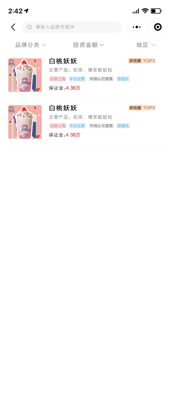
Product Evaluation
- Business core, 30-day-refund warranty was hard to read.
- Genre, price and location tabs did not exist or were hidden, which could be imployed for easy access.
- Bottom tab bar did not contain top-level sections and went out of context when browsing.
- Prototype did not use real data, which was hard to see problems.
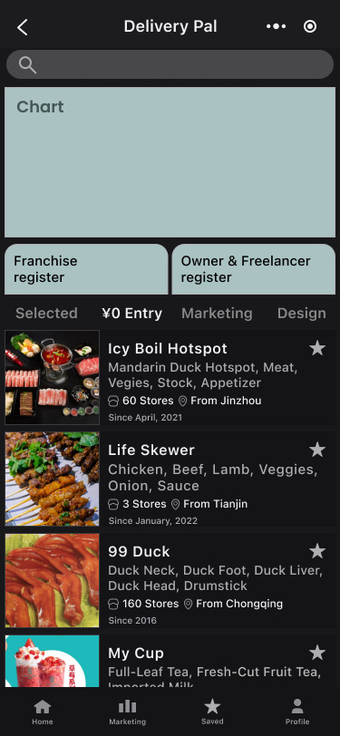
- Brand showcase on home screen lacked store photo and sales information, which could be difficult to compare.
- Waterfall brand browsing might be overwhelming for those users who have not yet considered switching brands.
- Branding was similar to market norm and was difficult to establish trust.
Walk-a-Mile
- Existing virtual restaurant platforms overwhelm user with marketing courses, talent pool, and data visualizations.
- Colleague constantly have difficulty building trust with clients.
- Restaurant owners want to improve food quality and the making process but lack the resources.
- New types of food gains instant popularity.
- Photography tab may not be needed during current stage, as most colleague use photos from the Internet.
User-Driven vs Business Practicality
- While presenting brand's sales data on home screen would benefit user to choose and compare, boss was concerned about user not tab into detail page.
- Even though boss supported the redesign, he was concerned that the new design would require back-end to change completely and persisted on launching the previous version first.
- Team did not have experience with figma or online file collaboration and lacked communication.
Mindmap
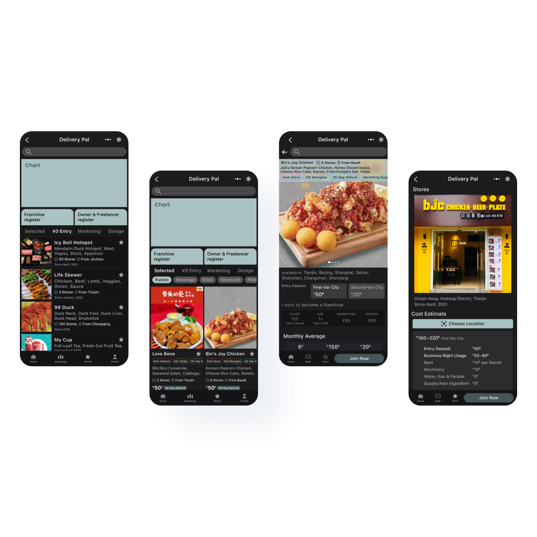
Prototype
Home Selected Before
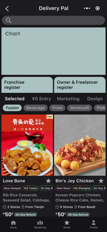
Home Selected After
¥0 Entry Before
¥0 Entry After
Selected Franchise Detail Page Before
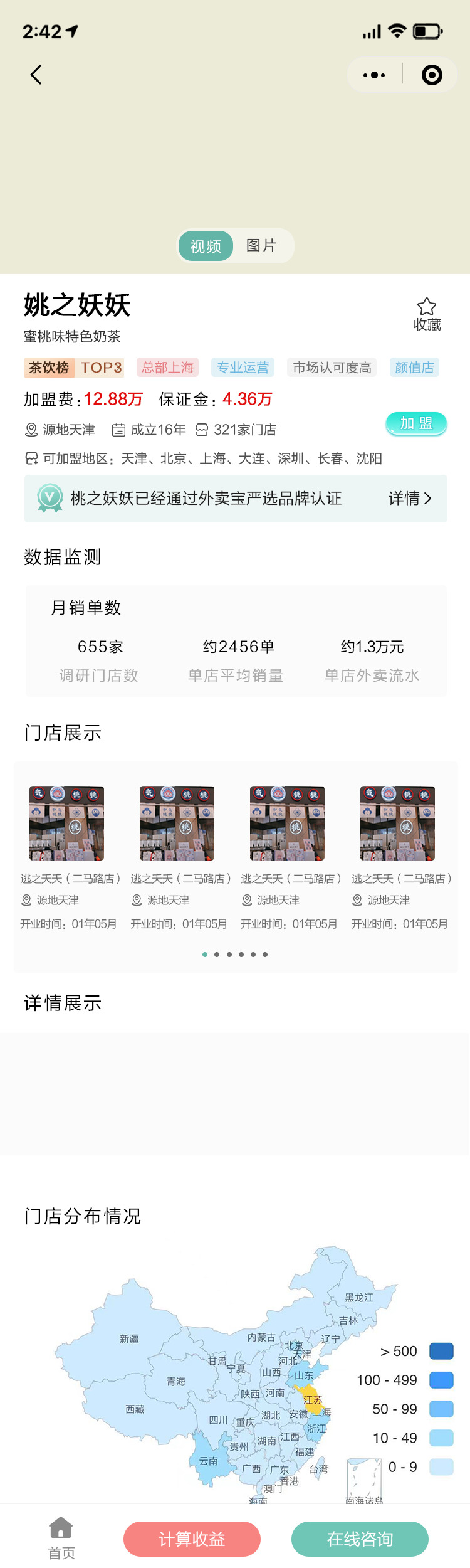
Selected Franchise Detail Page After
Reflection
- The redesign integrated cost and revenue calculation feature into the system and reduced user’s psychological barrier to share location information.
- The new interface is easier to read and establishes trust.
- Research finding about the need for location-specific cooking manual will serve as a potential direction for future iterations.