Novartis Internal Communication
UI, UX & Research
Overview
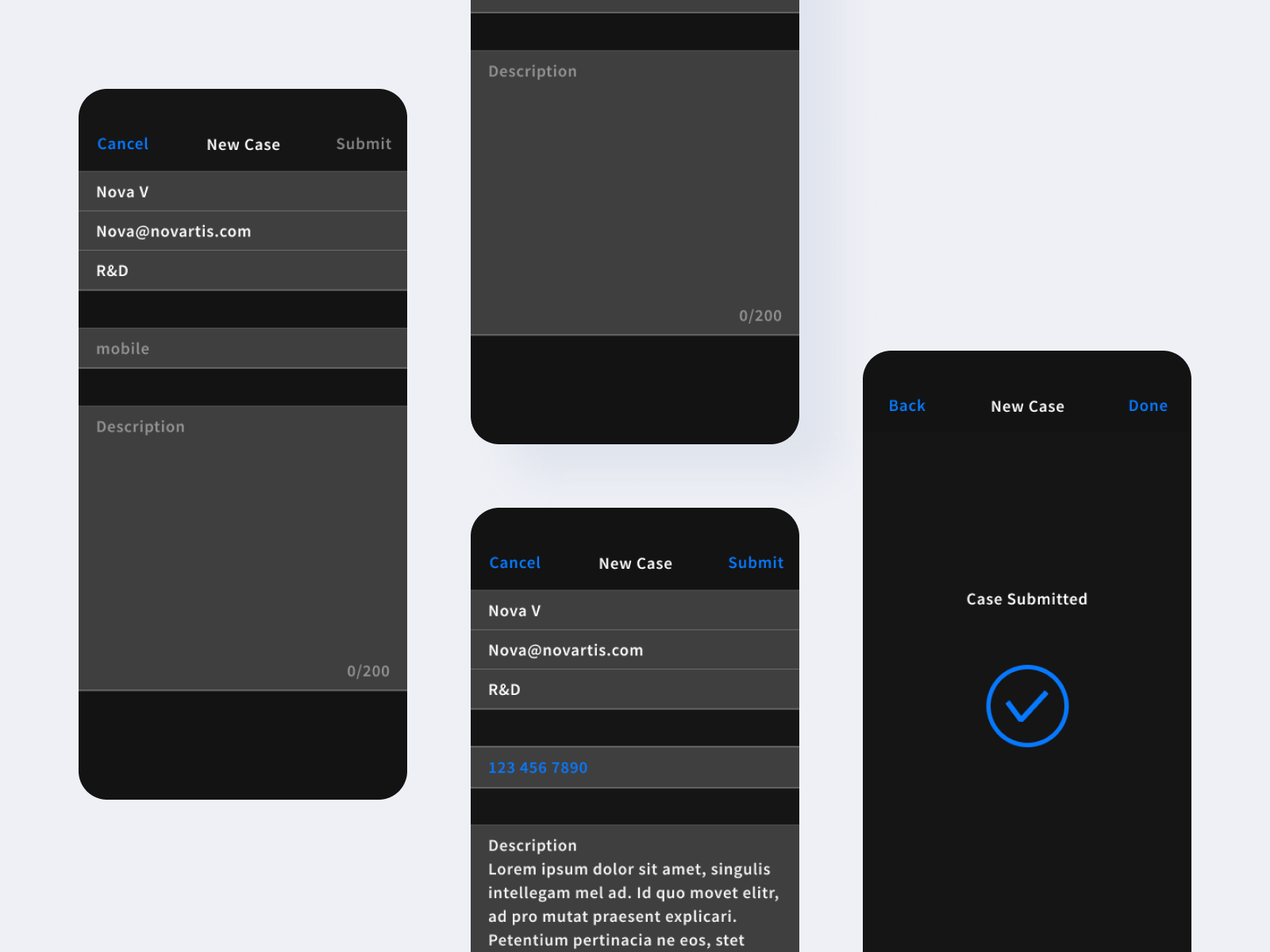
Novartis is building toB app to enable internal communication through tickets. I was asked to create a prototype base on the ticket submission requirements given.
My Process
- Look for inspiration in iOS Contact app
- Create wireframes
- Create interactive prototype and iterate
Research
- Load staff info (Name, Email, Department)
- Input mobile number
- Input message
- Submit
- Alert
- Confirm
- Complete submission
Use Case
Prototype

Figma File
Reflection
The prototype's style and navigation mimics iOS design system. I would need further info about the existing system to see how everything could play together.