OYO Ryokan-Booking
UI, UX & Research
Overview
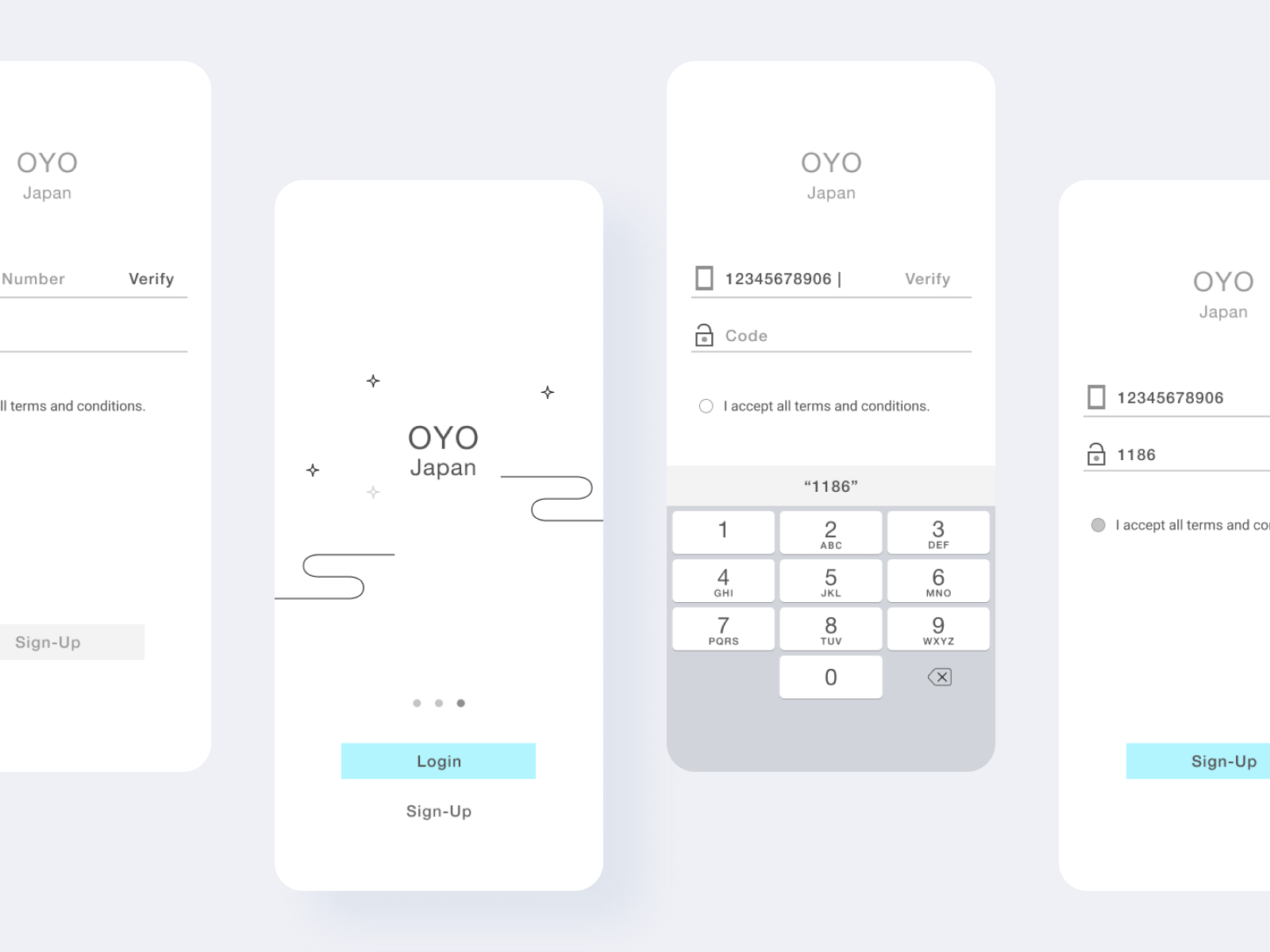
OYO offers budget hotel booking service on mobile and the web. Due to Japanese Ryokan's way of charging for room and dining, the Japan branch is under expansion to better serve the community. I was asked to create a mobile number sign-up flow for the job interview.
My Process
- Competitor research: Rakuten Hotel and Chinese apps such as CTrip, where mobile sign-ups has became standardized
- Find UI inspiration on Google and Pinterest
- Write use case
- Create wireframes
- Find icons to add to the prototype
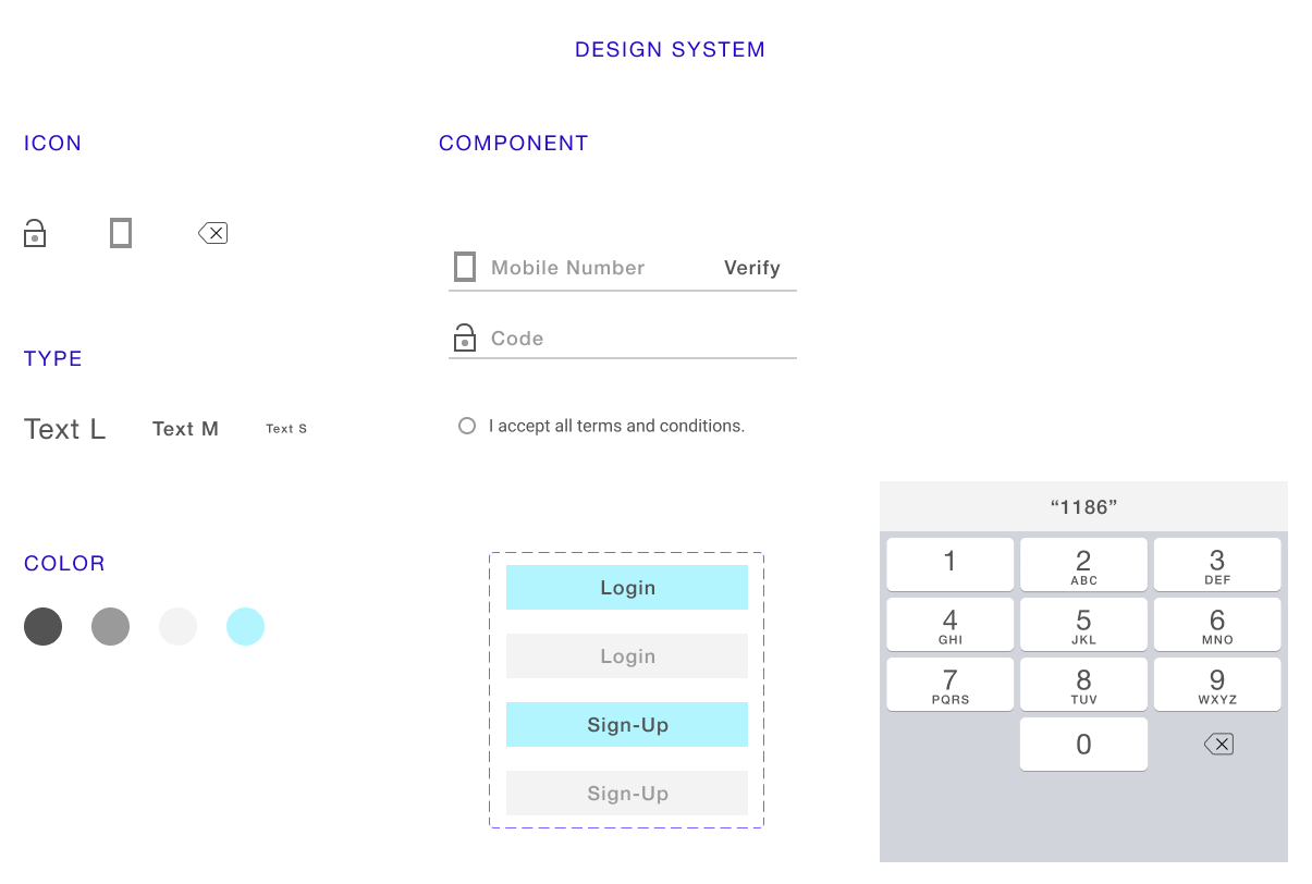
- Iterate: I changed "Send Code" button to "Verify" for simplicity
- Create interactive prototype and make adjustments
Research
- Open the app
- Read loading screen
- Start Sign-up
- Input mobile number
- Request passcode
- Receive passcode message
- Input passcode
- Agree privacy policy
- Finish sign-up
Use Case
Prototype


Figma File
Reflection
The mobile flow is easy to use and will help avoid drop out during registration.
